Case study
Reinventing Brightline coaching
Brightline provides mental health services — coaching and therapy — for children. We had been providing weekly online one-on-one coaching sessions, but needed to shift the business for financial reasons. Our goal was to design a new service where families could have monthly coaching sessions which would be supplemented by ongoing support through a digital experience.
UX canvas
The first step was to get all the teams aligned on what we wanted at a high level. Using the Lean UX approach, I facilitated a session where representatives from many teams (Clinical, Strategy, Engineering, Product, Design, Coaching, Marketing) shared their thoughts, and we identified and discussed any points of disagreement. The output was a single artifact that represented our collective needs and thinking around what we would create together.
Design workshops
I facilitated 2 cross-department workshops, one in-person and one virtual.
The in-person workshop was a kick-off to help us better understand the needs we were addressing and align on guiding principles. We also started to brainstorm different experiences.
In the virtual workshop, we split into teams and assigned a persona to each. Using drag-and-drop blocks of potential steps, each team mapped out how that persona might walk through the new experience. Not only did this session generate ideas, but it helped create a sense of co-creation and shared vision.
Storyboards
Based on our workshops, we landed on 4 potential concepts to explore:
Online coaching sessions
Personalized program
Weekly parent group sessions
Digital course
I sketched out different storyboards for these concepts. We conducted research with these storyboards to see how potential users (parents interested in mental health support for their kids) would react. We especially saw interest around the Personalized Program and Weekly Parent Group sessions.
Journey map
We decided to explore the Personalized Program concept in more detail. I created a high-level member journey to lay out the key steps in the experience and user objectives at each step. We shared this to make sure we were aligned across the many teams involved.
Flow diagrams
Next, we partnered with Engineering and Clinical teams to dive into details around multiple pathways and conditional scenarios. I created a flow chart that mapped out every step along the coach’s and member’s experience. This especially helped us uncover key areas that needed defining and ensured that we were aligned across teams.
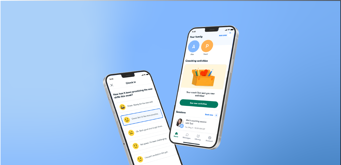
Wireframes
Once we had a better idea of the product experience, I developed wireframes for the potential screens so we could envision the flow and user interface.
Prototyping & testing
Once we had further developed the design, I collaborated with our Researcher and Content Designer to explore two key questions:
What do users think of the proposed design for receiving weekly activities alongside a monthly coaching session?
How effective and engaging are our activities and content?
I built 4 prototypes to show users in interviews. We tested the experience of receiving weekly activities as well as various sample articles, videos, and interactive exercises.
Design specifications
The final designs were delivered in Figma and covered a wide range of screens, including core functionality, updates to existing screens, and email. I also helped develop the components for our design system. I wrote out all of the product design specifications in Notion for the engineers (as well as other teams) to reference. This included mobile and desktop layouts, different states, and all functionality.
